Friends, explore the world of icon design with Icon Design and learn how to create eye-catching visual elements that enhance your brand identity.
(1) Understanding the importance of icon design-
It is important for brands to understand the importance of icon design. Icons are like visual ambassadors that convey the brand’s identity in a clear and memorable way. They improve user experience by simplifying complex tasks. In a crowded digital world, well-designed icons make your brand stand out, building trust and loyalty.”
Why does icon design matter for your brand?
Icon design plays a vital role in shaping your brand identity. Icons are like visual ambassadors for your brand. They’re small, yet powerful, as they convey the essence of your brand at a glance. When thoughtfully designed, symbols become memorable symbols that stick in people’s minds.
This recognition fosters trust and loyalty among your audience. In a crowded digital landscape where attention spans are short, icons act as beacons, leading users to the heart of your brand. Therefore, investing in professional icon design is not just an option; This is a strategic move to make your brand stand out and unforgettable.
How icons affect user experience-
Symbols are silent communicators that speak a universal language. They overcome linguistic barriers, making navigation seamless for users from diverse backgrounds. When icons are well-designed, they enhance the user experience by simplifying complex tasks. Think of the little “heart” icons on social media;
It needs no words to describe its purpose. It asks users to immediately “like” or “favorite” content. However, poorly designed icons can confuse users and disrupt their journey. Therefore, understanding how icons impact user experience is vital to ensuring seamless, enjoyable interactions with your digital platforms.
The versatility of icons in digital design-
Icons are like a Swiss army knife in digital design. They serve many purposes, from representing tasks to conveying information and guiding users. Icons can be found everywhere in the digital sphere, from mobile apps and websites to software interfaces.
Their adaptability and scalability make them indispensable. Be it a small icon in a mobile app or a prominent icon on a website’s homepage, icons are versatile enough to maintain clarity and functionality. They are the visual glue that binds different elements together in a cohesive and user-friendly way. Embracing their versatility empowers you to communicate effectively in the digital landscape.
(2) Elements of Effective Icon Design-
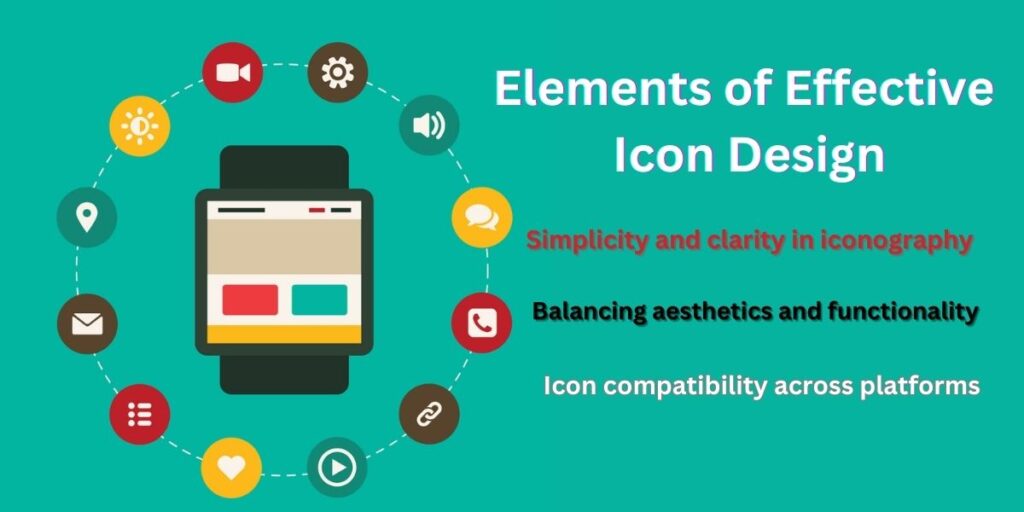
Simplicity and clarity in iconography-
Effective icon design embraces the power of simplicity and clarity. Symbols are smaller, visual cues tend to convey meaning faster. The best icons achieve this with minimal fuss. They turn complex concepts into easily recognizable symbols. Think of the classic “home” icon – a simple house shape that universally symbolizes returning to the main space.
Clarity is equally important; Markings should leave no room for ambiguity. When users encounter an icon, they don’t have to scratch their heads wondering what it means. Instead, they should immediately understand its purpose.
Simplicity and clarity come together to create icons that speak a universal language and enhance the user experience.
Balancing aesthetics and functionality-
In the world of icon design, aesthetics, and functionality go hand in hand. Aesthetically pleasing symbols attract attention, but they should also serve a practical purpose. An icon can be the most beautifully crafted piece of art, but if it does not clearly convey its intended message, it fails its functional duty.
The challenge is to achieve the right balance. Icons should be visually appealing without sacrificing the ability to communicate effectively.
This means carefully choosing shapes, colors, and details that enhance identity and usefulness. Aesthetic considerations should always align with the intended function of the icon to create a harmonious design.
Icon compatibility across platforms-
Consistency is the glue that holds your iconography together across different digital platforms. Users should find and recognize similar icons, whether they’re on your website, mobile app, or software program. This uniformity creates trust and familiarity.
This prevents confusion and ensures a seamless user experience. When designing icons for multi-platform use, keep dimensions, style, and colors consistent. This does not mean that all icons should be identical, but rather that they should share a common visual language.
Maintaining this consistency ensures that users can easily navigate and interact with your brand no matter where they encounter your icon.
(3) Icon Design Best Practices-
Researching your target audience-
Before diving into icon design, it’s important to know your audience inside and out. Who are they? What are their priorities and needs? Researching your target audience helps you create icons that resonate with them. For example, if your audience primarily consists of tech-savvy millennials, your icon might have a modern, minimalist style.
On the other hand, if you’re targeting an older demographic, a more traditional approach may be appropriate. Understanding your audience ensures that your icons speak directly to their tastes and expectations, making your brand more relatable and attractive.
sketching and brainstorming icon ideas-
Icon design starts with a spark of creativity. Start by sketching and brainstorming ideas to visualize your concepts. Sketching allows you to quickly trace different shapes and concepts. Don’t worry about perfection at this stage; It’s about creating a pool of ideas.
Brainstorming sessions can include your design team or even user feedback to gather diverse perspectives. These initial steps help refine your ideas and set the direction for your icon. Remember, the best icons often emerge from a process of trial and error, so don’t be afraid to experiment and iterate.
Choosing the Right Colors and Styles-
Choosing the right colors and styles for your icons is like choosing the right outfit for an occasion. This sets the tone and mood of your design. Colors evoke emotions, so consider the psychological impact of your color selection. For example, the color blue may indicate trust and reliability, while red may symbolize urgency or passion.
Style also plays an important role. Are you going for a flat, minimalist look, or do you prefer a more detailed and realistic style? Your choice should be in line with your brand identity and the message you want to convey. Keep in mind that consistency in color and style helps maintain a consistent visual identity across your icon set.
(4) Icon Design Tools and Software-
Top Icon Design Software Options-
When it comes to creating icons, you need to have the right tools. There are many software options designed for icon design, each with its own unique strengths. Adobe Illustrator stands out as a versatile option, offering a wide range of vector tools and a user-friendly interface.
On the other hand, Sketch is preferred by many designers for its focus on user interface (UI) design and vector capabilities. Affinity Designer is gaining popularity due to its affordability and robust features. Inkscape is a free, open-source option that is suitable for beginners and budget-conscious designers. Selecting the right software depends on your specific needs and familiarity with the tools.
Mastering vector graphics for icon creation-
Vector graphics are the lifeblood of icon design. They enable icons to maintain sharpness and clarity at any size, making them ideal for a variety of digital platforms. Mastering vector graphics means understanding how to create and manipulate scalable shapes that retain their quality.
This includes learning to work with anchor points, paths, and curves. Precision is important when designing icons, and vector graphics provide the level of control needed to achieve this. Learning these techniques allows you to create icons that are not only visually appealing but also functional on a variety of devices and screen resolutions.
The role of prototypes in icon design-
Prototyping plays an important role in the icon design process, which is often overlooked by designers. Prototypes help you visualize how your icons will look and function in the final product. They allow testing and refinement, ensuring that icons meet user expectations.
Interactive prototypes also provide insight into user interactions, helping you identify potential usability issues. Prototyping tools like Adobe XD, Figma, or InVision facilitate the creation of interactive mockups, allowing you to see how icons fit into the broader user interface. Adopting prototyping as part of your icon design workflow creates more user-centric and effective icons.
(5) Icon Design Trends to Follow-
Adopting minimalism in iconography-
In the ever-evolving world of icon design, minimalism has emerged as a major trend. Minimalist icons remove unnecessary details and leave only the essential elements. This clean and uncluttered approach appeals to modern aesthetics and promotes clarity. Minimalist icons are easy to recognize and understand, making them an excellent choice for user interfaces.
Their simplicity also ensures that the icons remain attractive across different devices and screen sizes. By adopting minimalism, you align your iconography with contemporary design sensibilities, ensuring that your icons feel fresh and relevant to today’s users.
The rise of animated symbols-
As digital experiences become more dynamic and engaging, animated icons have grown in popularity. Animated icons bring life to the user interface, provide visual feedback, and increase user engagement. These icons can effectively convey actions, changes, or micro-interactions. For example, a loading spinner icon may show progress or indicate that a process is running.
Animated icons add an extra layer of user interaction, making applications and websites more entertaining and user-friendly. Adopting animated icons can make your designs stand out and create memorable user experiences, but it’s important to use them judiciously to avoid overwhelming users.
Icon design for augmented and virtual reality-
With the rapid advancement of augmented reality (AR) and virtual reality (VR) technologies, icon design has become a new frontier. Icons in AR and VR environments must adapt to 3D spaces, giving users intuitive gestures and interactions. These icons need to align with the immersive nature of AR and VR, often floating in the user’s visual field or seamlessly integrated into the virtual environment.
Designers in this field face exciting challenges, such as creating icons that respond to user gestures and the user’s physical environment. Embracing the possibilities of icon design in AR and VR opens up innovative avenues for user interface design in these immersive digital realms.
“Elevate Your Brand’s Identity”
Explore our affiliate’s expert icon design services to elevate your brand’s identity. Get icons that resonate with your audience and leave a lasting impression.
(6) Icon Design for Mobile Apps-
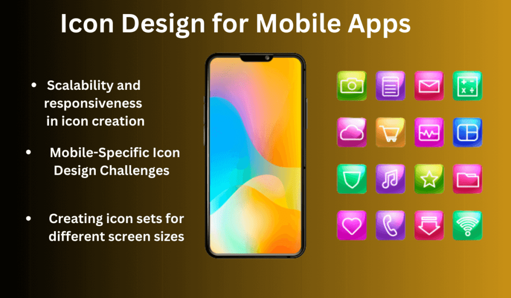
Scalability and responsiveness in icon creation-
Icon design for mobile apps demands careful consideration of scalability and responsiveness. Mobile devices come in a variety of sizes and resolutions, from small smartphones to large tablets. Icons must maintain their clarity and functionality across this spectrum.
When creating icons, start with vector graphics, which allow easy scaling without losing quality. Test your icons on different devices to make sure they look and function as intended. Responsive design principles should guide your icon creation, ensuring that they seamlessly adapt to the screen size, maintaining a consistent and user-friendly experience across the mobile app ecosystem.
Mobile-Specific Icon Design Challenges –
Designing icons for mobile apps presents unique challenges. Icons are needed to communicate information clearly and concisely in limited-screen real estate. The small size can make it challenging to include complex details, making it essential to focus on simplicity and clarity.
Touch targets should be large enough for users to comfortably interact with, preventing accidental taps. Icons should align with the overall design language of the app and follow platform-specific guidelines, such as those provided by Android or iOS, to maintain a cohesive and intuitive user experience. Addressing these challenges ensures that your mobile app icons enhance usability and visual appeal.
“Iconic Graphics Tailored to You”
Get custom icon designs that cater to your unique needs. Click here to access our affiliate’s icon design specialists and stand out from the competition.
Creating icon sets for different screen sizes –
Mobile apps are not one size fits all, nor are the icons within them the same. Creating icon sets that suit different screen sizes is essential to providing users with a seamless experience. Icons that work well on a larger tablet may not be suitable for a smaller smartphone screen.
Therefore, it is important to design multiple versions of icons optimized for different screen sizes and resolutions. This ensures that your app’s icons remain attractive and functional across a diverse landscape of mobile devices. Consider testing these icon sets on different devices to improve their appearance and usability, which will ultimately enhance the overall user experience.
Icon Design Insights and Inspiration”
Dive into the world of icon design with our affiliate’s insightful resources. Click now to gain inspiration and knowledge for your design projects.
Read This- “Dive Deeper into the UX Design Process to Achieve Success in UX“
FAQs-
Q 1:- What is an icon design and why is it important for brands?
Icon design involves creating small, visual symbols to represent different actions, concepts, or objects. Symbols are essential for brands as they enhance brand identity and communicate messages quickly and effectively.
Q 2:- How do icons affect user experience (UX)?
Icons improve UX by simplifying navigation, aiding visual communication, and making the user interface more intuitive. Well-designed icons increase user engagement and satisfaction.
Q 3:- What are some best practices for icon design?
Best practices include prioritizing simplicity and clarity, conducting user research, and ensuring consistency across all platforms. These principles help in creating effective and user-friendly icons.
Q 4:- What software and tools are recommended for icon design?
Top software choices for icon design include Adobe Illustrator, Sketch, Affinity Designer, and Inkscape. The choice depends on your specific needs and familiarity with the equipment.
Q 5:- Why is mastery of vector graphics important in icon creation?
Vector graphics allow icons to remain sharp and clear at any size, making them suitable for a variety of digital platforms and screen resolutions.
Q 6:- What is the role of a prototype in icon design?
Prototyping helps to visualize how icons will look and function in the final product, allowing for testing, refinement, and user interaction evaluation.
Q 7:- What are some current trends in icon design?
Current trends include the adoption of minimalism in iconography, the rise of animated icons for better user engagement, and the adoption of icon design for augmented and virtual reality experiences.
